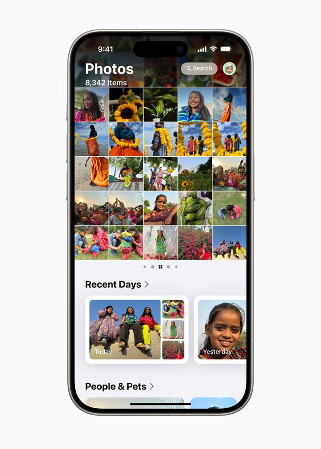
This is where I show you how to get back to the clear and neat interface of the Photos application on your iPhone. With the latest iOS 18 update, many new features include changes to the structure of the application itself and make it messy-looking rather than neat, which makes looking at it a bit much.
Well, happily, there is a method through which to change this back to its simple, more organized view. Read further to learn!
iOS 18 brought some significant design changes to the Photos app on iPhone. While new features are good, they made the app feel a bit chaotic for some. If you’re finding it hard to sail through the app, and you just want it to work like it used to, then you are in the right place! This tutorial is going to demonstrate the steps to restore the old layout of the Photos app on an iPhone using the quickest, easiest steps.
Why the Photos App Changed
Apple’s latest update brought in a host of features, including AI sorting of photos, advanced search capabilities, and new ways of organizing your media. These have cluttered the app for those who prefer it a lot simpler.
The good news? You can revert easily to a much simpler and more manageable version of the Photos app.
Steps to Restore the Old iPhone Photos App Layout
Open the Photos App
The first thing you need to do is open your iPhone’s Photos app. If you’re like many users who are overwhelmed by the changes, you’ll notice that there’s a lot more going on than you’re used to.
Scroll Down to Find “Customize and Reorder”
Once you’re in the app, scroll down to the bottom of the screen. You’ll see an option labeled “Customize and Reorder.” This is where you can start trimming down the features you don’t need.
Deselect Unwanted Features
Click on “Customize and Reorder,” and you’ll be presented with a list of features you can toggle on or off. To make your Photos app look like the older version:
- Deselect all options except for “Albums,” “Utilities,” and “Media Type.”
- By turning off the extra features, you’re left with a much simpler and familiar layout.
Save Your Changes
Once you’ve customized the app to your liking, make sure to save your changes. The app should now look and feel much closer to what you were used to before the update.
https://www.tiktok.com/@duncanzz/video/7416435184469331205?is_from_webapp=1&sender_device=pc&web_id=7387770631322535430
Why Keep Only "Albums," "Utilities," and "Media Type"?
These three sections — Albums, Utilities, and Media Type — offer all the basic functions that most users need. By keeping just these, you reduce the clutter and complexity, making the Photos app more user-friendly and less overwhelming.
- Albums: Easily access your photo collections.
- Utilities: Useful tools like recently deleted photos or hidden albums.
- Media Type: Sort your photos and videos by type, such as panoramas or screenshots.
Benefits of Reverting the Photos App Layout
By streamlining the Photos application, you make it more accessible to yourself, and your productivity enhances because instead of going through a number of options, you may directly reach what you are looking for. This also consumes less processing power, which will save the battery.
Well, if you were frustrated with the recent iOS 18 changes to the Photos app, now you know how to get back to that simpler, more intuitive layout. By following these quick steps, you will manage to enjoy a cleaner interface, closer to the classic Photos application.
Now go ahead and spread this guide to your friends, and do not forget to follow us for more tips and tricks related to iPhones!

